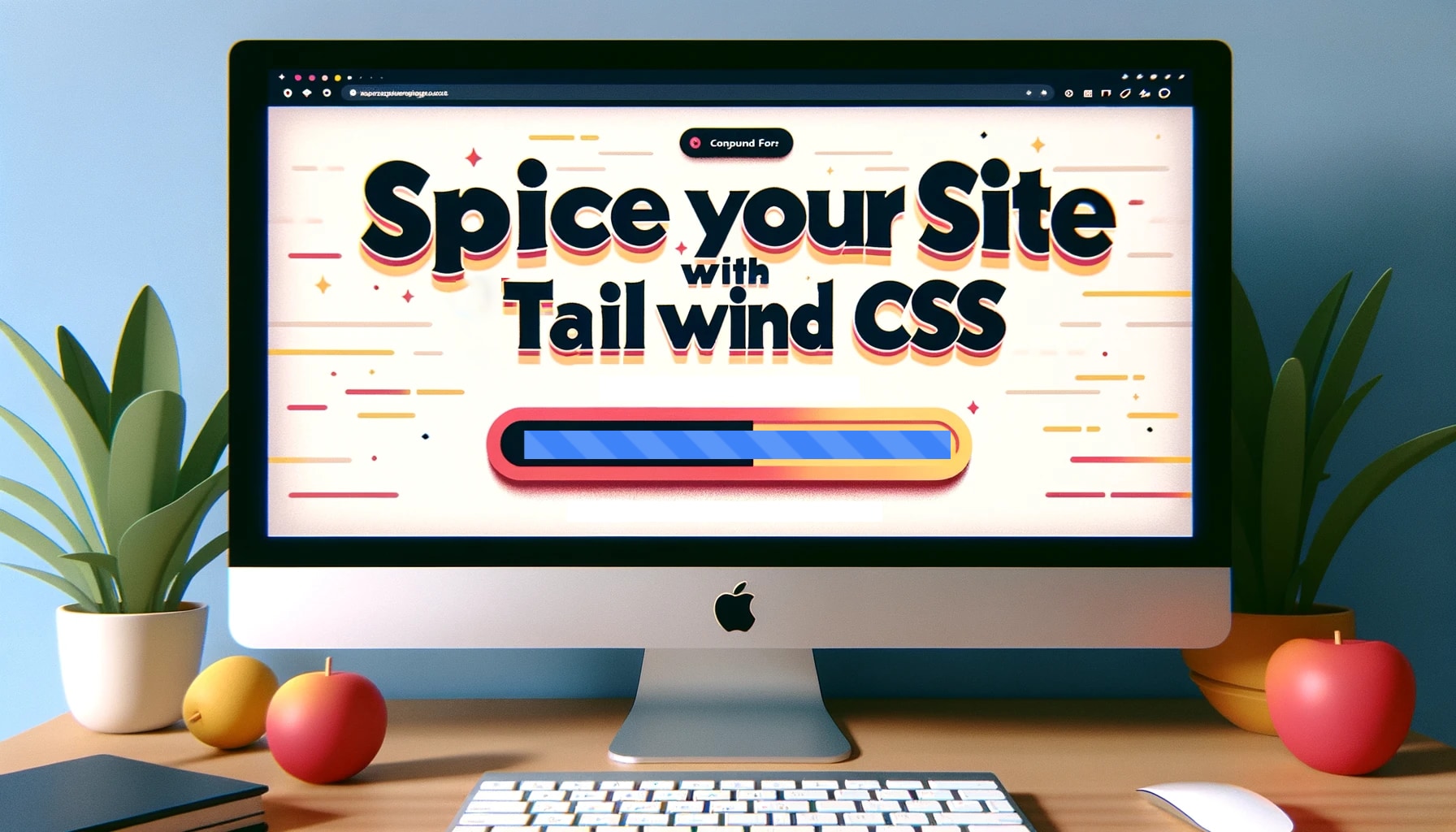
So, the other day I was tinkering with my website and had this idea to add a lively progress bar. And guess what? With Tailwind CSS, it was a breeze! Let me show you how
HTML:
<div class="relative w-full h-6 bg-gray-200 rounded">
  <div class="absolute left-0 top-0 h-full bg-blue-500 rounded striped"></div>
</div>
CSS (Tailwind magic!):
@keyframes move {
  0% {
    background-position: 0% 0%;
  }
  100% {
    background-position: 100% 0%;
  }
}

.striped {
  width: 100%;
  background-image: linear-gradient(
    45deg,
    rgba(255, 255, 255, 0.15) 25%,
    transparent 25%,
    transparent 50%,
    rgba(255, 255, 255, 0.15) 50%,
    rgba(255, 255, 255, 0.15) 75%,
    transparent 75%,
    transparent
  );
  background-size: 50px 50px;
  animation: move 2s linear infinite;
}background-image: This gives our progress bar those animated stripes. We’re using a linear gradient here, and the RGBA values determine the color of the stripes. Feel free to play around with the colors!background-size: This determines the size of our stripes. Bigger values = bigger stripes!animation: This applies ourmoveanimation to the progress bar. The2sis the speed. If you want faster stripes, decrease this value; for slower stripes, increase it.
There you go! A progress bar with animated stripes! If you’re looking for a quick way to add some flair to your site, this is it. Give it a try and let me know how it goes!


